Thursday, 4 April 2013

Promotional Material

          Sweet wrapping paper
  1.        Promotional Cup


 Sweet packaging design for everyone to have the same to emphasis the sharing element of having sweets when you were little. In the style of  the old penny sweets packaging with a new vamp.

National Sweet Day

For my final Major project i want to organise a day dictated to just eating sweets, scrap the diet. While taking a nostalgic trip down memory lane. Firstly from a survey i decided to play around with the bad memories people had of sweets one being liquorice  ewww. Looking into promotional material creating a logo, badges and wrapping paper.


Tuesday, 1 January 2013

Book Cover

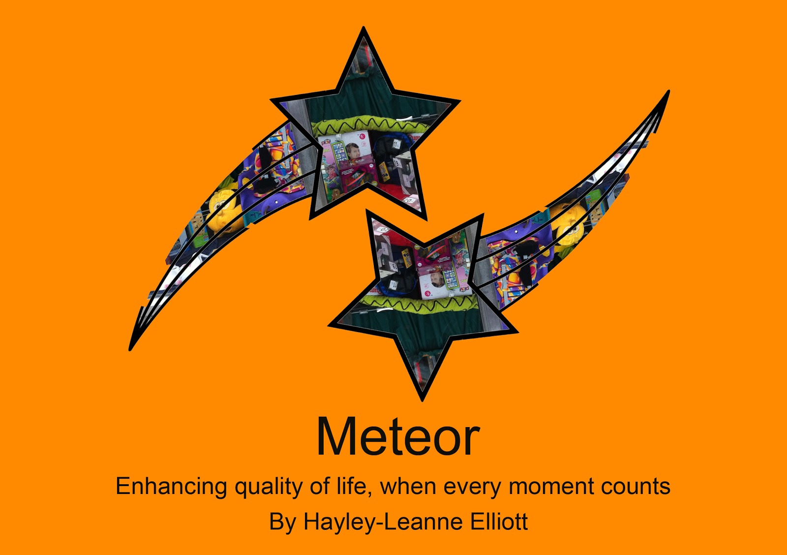
This Design i choose to you for my front cover as i felt it related to my sabbatical the most. The idea of keeping the shooting star aspect and interpreting it in my own way to still make that critical connection. The stars go forward and backward/ pass each other  this shows synchronicity showing how two separate entities can come together with the two shooting stars crossing paths. Which can show how tWo separate lives come  together and create something unique and great and help each other. The Title  links to the design as most shooting star are meteorites moving at high speed. Sometimes in life things can change quickly for the better or worse and i feel this shows a perfect example. The quote is used off the shop wall  in which i worked. Meteor also relates to inside the book as the images are fragments of  what i saw and what i experienced. In relation to that a meteor  is usually a fragment of larger comets which is what my book shows although this was never intended only something i saw after the finished product was decided. I then decided to add colour  to make the front cover more eye catching however i felt this overpowered the image therefore i choose to leave the background white for all the pages.


Books Last Few pages

With all the book pages i wanted my images to be placed in the middle of the bidding so fragments of the images was lost and i have no control over what parts will be lost in the publishing stages. All the ideas are ones in which  i can with my oblique strategies one i had the most was the shapes i felt this made my images more visually interesting. The traffic light image was designed on a leg of a shelf in the store room with all the toys, i decided to add a traffic light effect to the pole as on the shelf was a toy car garage and it gave me connotations of a traffic light.
The second image is an extract of the shop in the form of a paint splat which allows the viewer to see the toys on the shelves in a a neat and tidy order which is a direct contrast to the imagery of a paint splat. which is a relation usually to how toys will usually start tidy and become messy while children play. The Third design was a toy that stood out to me one of the oblique strategies was to cut out an image i decided to mirror this image to show the colours of the toy that attracted my attention.
The forth page was another oblique strategy where i had to take a few  images and make them appear as one which i feel this worked well. The word toys  is place above the image in a playful way almost as if the word is also being played with. The last design in these images show the lights transcending into the book indicating a journey maybe?.